Designing a website or any other visual project is a complex process that requires attention to detail. Even the smallest mistakes can have a big impact on the overall result. However, some mistakes are more subtle and may not be immediately noticeable.
In this article, we'll explore 9 seemingly insignificant mistakes that can actually ruin the overall design. From inconsistent icon styles to a lack of contrast between foreground text and background, these mistakes may seem minor, but they can have a significant impact on the user experience.
By understanding these mistakes and taking steps to avoid them, you can create a professional, cohesive design that effectively communicates your message.
1. Inconsistent icon styles
Icons can be a useful tool for adding visual interest and helping users navigate a site. However, using icons with different styles can be distracting and take away from the overall aesthetic. It's important to use icons that are consistent in style to create a cohesive look.
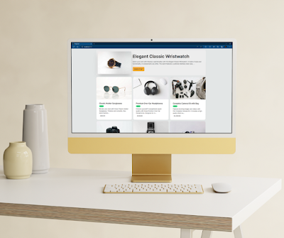
2. Magnificent images pushed to the background
High-quality images can add visual interest and help convey your message. However, if they are pushed too far into the background, they can become lost and fail to make the desired impact. Be sure to place images in a prominent position where they can be easily seen and appreciated.
3. Lack of contrast between foreground text and background
Good contrast is essential for making text easy to read. If the foreground text doesn't have enough contrast with the background, it can be difficult to read and cause strain on the eyes. Be sure to choose colors with enough contrast to ensure that the text is legible.
4. No white space to allow the design to 'breathe'
White space, also known as negative space, is the area around and between elements on a page. It's important to include enough white space to give the design room to breathe and not feel cluttered. Too little white space can make a design feel cramped and overwhelming.
5. No clear content hierarchy
A clear content hierarchy is essential for helping users navigate a site and understand the most important information. Without a clear hierarchy, the user may become confused and overwhelmed. Be sure to use headings, subheadings, and other formatting tools to establish a clear hierarchy.
6. Too many choices and buttons overwhelm the user
Giving users too many choices or buttons to click can be overwhelming and lead to decision paralysis. It's important to find a balance and only include the necessary options to avoid overwhelming the user.
7. Asking for excessive information upfront
Asking users for too much information upfront can be off-putting and cause them to abandon the process. It's important to strike a balance and only ask for the necessary information to avoid overwhelming the user.
8. Too many distractions in long articles
When it comes to long articles, it's important to keep distractions to a minimum to keep the user engaged. Too many distractions, such as pop-ups or ads, can pull the user's attention away from the content and potentially cause them to leave the site.
9. Inconsistent layout
A consistent layout helps create a cohesive look and makes a site feel professional. An inconsistent layout, on the other hand, can be confusing and make a site feel disjointed. Be sure to create a consistent layout to create a cohesive look.
Conclusion
In conclusion, it's important to pay attention to even the smallest details when it comes to design.
These 9 seemingly insignificant mistakes can have a big impact on the overall result and should be avoided. From inconsistent icon styles to a lack of white space, these mistakes can distract from the overall aesthetic and make a site feel disjointed.
By keeping these mistakes in mind and taking steps to avoid them, you can create a professional, cohesive design that effectively communicates your message.
Remember, it's the little things that can make all the difference in the success of a visual project. Don't let these subtle mistakes ruin all of your hard work – pay attention to the details and create a design that truly stands out.