Fitts’s Law of Acquiring Touch Targets: Why We Want the Buttons to be Bigger, Bolder & Brighter?
Fitts's Law states that the time to attain a target is directly related to the distance of the target and its relative size. In UX Design, this means that all the links or touch buttons should be large enough or the user will take too much time finding them.
They should be placed with enough white spaces in between, i.e. they shouldn't be cramped up with other content, or else, the user will accidentally click on a link that wasn't supposed to be clicked, and be frustrated with the interface.
And lastly, the links or buttons or touch targets must be placed in a reachable location on the screen, such that they can be easily acquired without having to search for the same.
But Why so? and How to? Read on to find out!

Previously...
In the previous article on Jakob’s Law of Familiar Expectations: 10 Laws of UX Design that Use Psychology to Create Better Products & Services we discussed that users expect your websites and apps to function in a familiar way as they're used to before.
We uncovered the origins of this psychological principle. We talked about how existing mental models have helped human beings make sense of their present situations based on their past experiences. We looked at some of the examples of Jakob's Law in our present digital world.
We gave some examples of how sudden uninformed changes to some websites can cause mental discordance amongst users, which ultimately causes them to freak out, and maybe stop using the website at all.
Here's a list of 10 time-tested powerful laws in UX based on psychological concepts that go way beyond the field of computers:
- Jakob’s Law of Familiar Expectations
- Fitts’s Law of Acquiring Touch Targets
- Hick’s Law of Temporal Variability of Choices
- Miller’s Law of Short Term Memory Capacity
- Postel’s Law of Empathic Inputs and Conservative Outputs
- Peak–End Rule of Memorable Experiences
- Aesthetic–Usability Effect of Visual Design
- Von Restorff Effect of Remembering Contrasting Elements
- Tesler’s Law or the law of conservation of complexity
- Doherty Threshold of Increased Productivity with Instant Feedback
And Now...

1. Brief Overview of the Fitts's Law in UX Design
I believe everyone here has used one of the most common kitchen appliances ever, the microwave oven. Have you ever noticed the control panel on the right? Have you ever questioned yourself about the size and positioning of those buttons? If not, please go to the kitchen and observe one right now!
Let's take another scenario. Have you ever observed the control panel inside an elevator? Did you notice their round shape? Their large enough size to accommodate your finger? And their placement which is comfortable for you to reach?

Now imagine if the buttons on the microwave and elevator control panel were smaller than their actual size. Imagine if they were all extremely close to each other.
And what if, instead of being placed right in front of you, they were placed somewhere else? Maybe at the side of a microwave or at the back wall of the elevator under the guard rail, way beyond your reach?
Place yourself in such a situation and try to think about how you would've felt when your targets were way beyond your reach. Would you be frustrated? anxious? angry at the product company? waiting to return your product? afraid to get in such a malfunctioned elevator?
This is called a bad user experience that came from neglect of usability, which is one of the key aspects of good design.
Usability means how easily a user can use your product whether it is physical or digital. better usability means that the interface is easy to navigate without any distractions or difficulties, and is equally easy to understand in terms of functioning and language.
Digital interaction ought to be painless, should require minimal effort from the user, and in most cases, should be a straightforward task.

Don't they say, time is money? Time. The one dimension that binds us all. Time is the most critical resource we humans possess, besides energy and money.
The most important factor is the amount of time it takes for a user to reach and engage with an interactive object on the screen such as a button, a search bar, a hyperlink, or some important information.
UX/UI Designers and Visual Designers need to ensure that they appropriately size and position such interactive targets on a screen such that they are easily selectable and fall in an easily selectable region for the comfort of the user's experience.
This design challenge is often enhanced by the multiple ways in which people interact with their screens these days, i.e. mouse, remote, joystick, game controller, touchpad, keyboard, fingers, voice commands, etc.

Here comes Fitts's law to rescue. It clearly states that the amount of time a user takes to engage with an interactive element on a screen is directly related to the size of the element and its distance on the screen.
In other words:
As the size of the element increases, the time that is taken by a user to select it decreases.
As the size of the element decreases, the time that is taken by a user to select it increases.
As the distance a user must move to select an element increases, the time to select it increases.
As the distance a user must move to select an element decreases, the time to select it decreases.
Time taken by the user is directly proportional to the distance the user must move.
Time taken by the user is inversely proportional to the size of the element user needs to select.
2. The Origins Story of Fitts's Law in UX Design
In 1954, an American psychologist, Paul Fitts postulated that the time taken to rapidly move to a target area is a function of the ratio between the distance to the target area and the width of the target area.

To this day, this prediction is used in human-computer interaction and ergonomics to model the act of pointing towards target areas on different interfaces.
He even gave the index of difficulty metric to actually measure the difficulty of a target selection task, which is a logarithmic equation I'm not going to mention here.
3. Fitts's Law in Action, Examples in UX Design

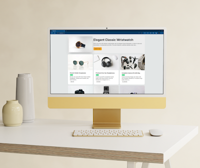
Form Fields and Text Labels

Placement of the Call-to-Action Buttons
Have you ever paid attention to the call to action buttons on your most frequently visited websites and apps? Do you wonder why are they placed in that particular location and why not somewhere else? It's because they want to reduce the effort and time of their users to reach the buttons.
Google's search page has the call to action buttons right at the center of the page below the search input field. All the necessary buttons on your social media apps are pinned right at the bottom bar of the app screens, right where your fingers can reach quickly without much stretching.

Ever wondered why the submit buttons on most forms are located at the bottom right end of the form? It's because that's the natural path of your pointer, either keyboard or mouse, that it'll take to click on that submit button.
Why do you think Windows 11 has adopted the design scheme of Apple and shifted its taskbar right at the middle of the screen after so many years of being at the difficult left? It's because it's easy to reach those apps and buttons at the center of the screen that is at the left bottom.

All of this is to ensure that the distance to the call-to-action target area is minimized for the user!
The Proximity of Buttons & Errors
Who here uses LinkedIn to build professional social networks? I do and you can connect with me on My LinkedIn Account. I'm sure you use it too! Have you noticed something peculiar yet frustrating in its UX?
The next time someone sends you a friend request, I want you to focus on the placement of the 'tick' and the 'cross' circular buttons that allow you to accept or reject a connection request.
They are so close to each other that you'll feel troubled and will probably have to use your smallest fingertip to make the selection. The chances of error in such a situation are so high that you might end up accepting an unknown's friend request, or worse, rejecting the request of your current manager!

In such situations, UX/UI designers and developers need to pay attention to the touch target area for a user.
They need to keep the buttons adequately spaced from each other so that there's no clash or overlapping while being tapped on by the users.
They need to place it in the area of maximum reachability i.e. the center of the screen, or somewhere prominently visible and accessible.
Don't hide away the 'Buy Now' or 'Read Now' or 'Get Services' or 'Download Now' buttons at the corners of the webpage or your app. These are the buttons that will get you business, increase your sales, spread your brand, and make you famous!
Hide the buttons that you don't want your users to access the most like the 'Privacy Policy' or 'Unsubscribe'. Just kidding, although companies use the tricks of visual design, designers shouldn't make it hard for users to get rid of a product or service.
Provision of One-Handed Mode
Let's agree that we have all mocked Apple recently for giving up on innovation and simply releasing new smartphones with bigger screens. The whole point of having a smartphone was to have a pocket-friendly device that would help us do our day-to-day jobs.
I guess the day Steve Jobs launched the first iPod by saying that it could fit in the tiny redundant jeans pocket, he wouldn't have imagined how crazy we will become about bigger screens and bigger phones.
I've recently given away my 6.99" screen size smartphone to buy one that was smaller to fit in my hands. I could only go down to a 6.5" screen size.
After prolonged use, I found that my fingers started aching because of all the inaccessible buttons on the screen at the top right or top left of the screen. What was the solution to this? One-handed mode.

Thankfully, designers and developers have found a way to shrink the screen size on any smartphone with the one-handed mode. I found a similar feature on my smartphone keyboard too. Way to make the lives of users easier!

Similarly, the 'Reachability' feature of Apple's iPhone 6 and 6 Plus allows the users to bring the necessary apps and functions to the bottom of the screen with a simple gesture making their lives easier.
Digital Interfaces within Cars
Now, this is the trickiest one. Designers and developers have struggled with creating the most comfortable and easy-to-use interface for car drivers. A lot of them have experimented with replicating the smartphone's Android interface.
Some have incorporated voice commands and integrated Google Assistant. Some have tried to simplify the UX that could help the drivers to focus more on the road and the driving rather than on the screen. But we don't see a perfect solution just yet. Why?

Because while using a smartphone or a desktop or a laptop, you're not indulged in anything else. Okay, you might be working in the office or trying to study for your exams, but those or not tense situations. Also, to complete a task you don't have to move your hands far away from whatever you're doing.
But while driving, your primary focus is driving the car. Your hands are at least half a foot away from the screen in front of you. You cannot afford to lose focus on driving and give your full attention to the interface. With a slight detour, it can become a life or death situation.
Frustrations such as accidentally tapping on the wrong button; not being able to find the navigation buttons; Bluetooth not connecting with the mobile phone; internet connection problems that need to be addressed in the settings panel; GPS navigation not working properly or losing route; interrupting unnecessary notifications from the connected smartphone; voice assistant not being able to listen or speak properly; and many more can cause the drivers to lose focus on the road.

Designers and developers who get a chance to work on such vehicle screens or panels, need to ensure they're not distracting the drivers from their main task of driving.
They need to provide simple navigation; keep the action buttons large, prominent, and sufficiently spaced apart from others to avoid errors.
They should provide haptic touch feedback and audio feedback on being tapped so that the user won't have to shift his vision from the roads to the screen every time.
4. Key Considerations While Applying Fitts's Law

Touch Target Sizing
- Nielsen Norman Group suggests a minimum touch target size of 1cm by 1cm.
- Google's Material Guidelines suggest a minimum touch target size of 48 by 48 dp.
- Apple's Human Interface Guidelines suggest a minimum touch target size of 44 by 44 pt.
- Web Content Accessibility Guidelines (WCAG) suggest a minimum touch target size of 44 by 44 CSS px.

Touch Target Spacing

Touch Target Placement


5. Summary of Fitts's Law in UX Design